The prescribed burns that went wrong in New Mexico
In January 2022, authorities in New Mexico, USA, began a series of prescribed burns. Months later this became the worst fire catastrophe in this state.
Prescribed, or controlled burns, are fires that are carefully planned and designed by experts for forest management. The goal of these fires includes the restoration of natural woodlands and landscape management. Most importantly, prescribed burns are used to reduce the amount of potential fuels present in the woodlands. Reducing woodland fuels leads to a reduced risk of uncontrolled fires appearing due to lightning or human activities.
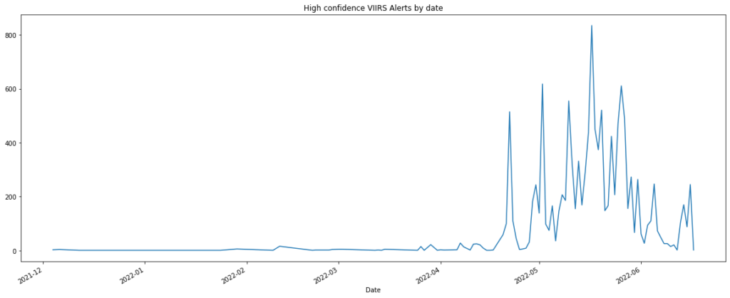
In January, a small set of prescribed fires was started by a team of federal employees in New Mexico, in the south of the United States. Three months later, in April, some of these fires escaped control due to a combination of hot, dry and windy conditions. Part of this story can be seen on the following graph, showing high confidence VIIRS fire alerts in a study area enclosing the national forests affected by the fires from December 2021 to the 20th of June 2022. It can be seen that by the end of April the number of fire alerts skyrocketed, reaching its overall maximum around the middle of May.
One of the most important wildfires occurred in the northern part of New Mexico, in the Santa Fe National Forest. This fire is now known as the Hermits Peak wildfire and it is one of the worst forest fires in the history of New Mexico. By the 8th of May, this fire had burned an estimated area of 680 km². By June 17th, the area went up to 1070 km², which averages to almost 10 km² burning per day. You can find a detailed report about this fire here.


Overall, we estimate that the total amount of surface burned in our study area for Mew Mexico by June 20th is about 2825 km², an area bigger than the city of Los Angeles.
Many of these uncontrolled fires happened close to urban areas, where the population was evacuated. Several buildings were reached by the fire, leading to thousands of people losing their homes and businesses. Currently, the US Government is being held responsible for the disaster and families are demanding remuneration for their losses.
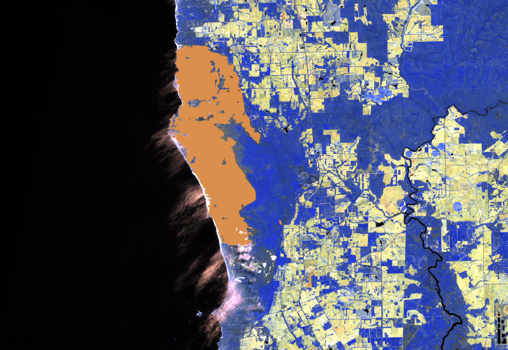
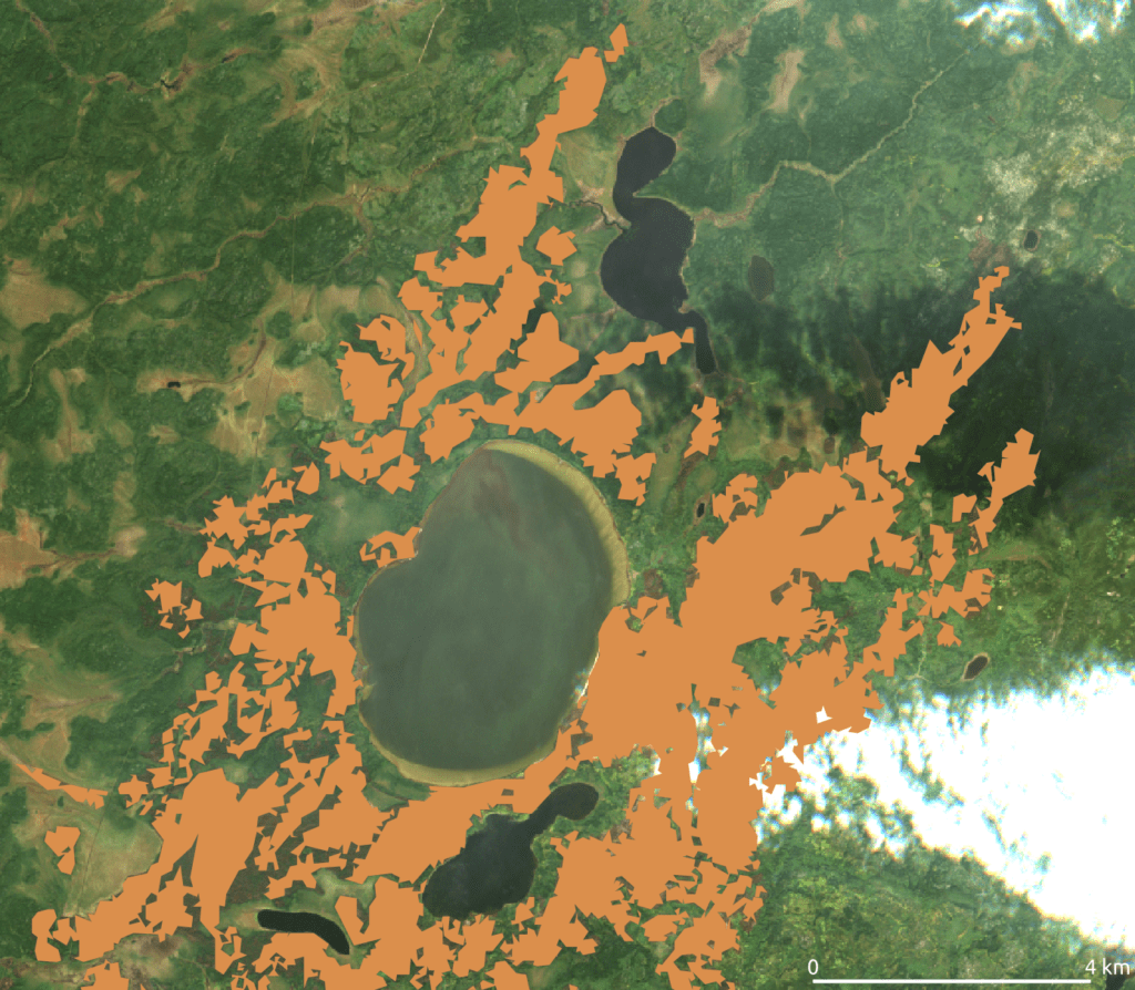
As the last part of our series about our BlazeMap™, below you can explore the dates and extent of the burned areas in our study region for New Mexico from 1st March 2022 to 20th June 2022. The areas are classified according to a pixel-wise based machine learning model.
The Fire Season in Western Australia 2022
Australia is widely known to have an extensive fire season during Summer. However, in recent years it is common that the fire season extends to Autumn or even Winter each year. In fact, a recent study suggests that the burned area during this season has increased exponentially in the last thirty years. Furthermore, the study links the overall increase in burned areas of Australian forests to climate change.
In the year 2021, the area of West Australia, in the vicinity of the city of Perth, was affected by a heavy fire season that extended all the way to December and the beginning of January. In the first days of December 2021, a huge fire raged close to Margaret River. The fires went on for the rest of December 2021 in this area and all this is registered in satellite imagery publicly available.
Climate change is a global phenomenon, and it is expected that the trend we see in Australia will follow on a bigger scale for areas prone to forest fires. For this reason, there is a need for an improved, precise and scalable way to assess the area lost to forest fires on-demand and on a global scale. My goal in this post was to assess the extent of the forest fires in a study area around the city of Perth, West Australia, starting from August 2021 and ending in March 2022, using the pipeline we have designed for this task here in EDEO.
Study area
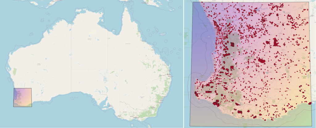
Below I show the study area I worked with to study forest fires that happened in Southwest Australia, in a region comprising the city of Perth, Margaret River and several State Forests. Also shown are red points corresponding to VIIRS fire alerts from 2021-08-01 to 2021-03-31. According to these points, we can see that a couple of big fires happened in the southwest area of the study region and also that it seems that some of the fires extend up from this corner through the green area along the east coast. This area includes several national forests like the Jarrahwood, Blackwood, Mumballup and Dwellingup National Forests, among others.
To get an idea of how heavy this fire season has been, I decided to plot the high confidence VIIRS fire alerts by day from December of 2018 to the end of March of 2022:
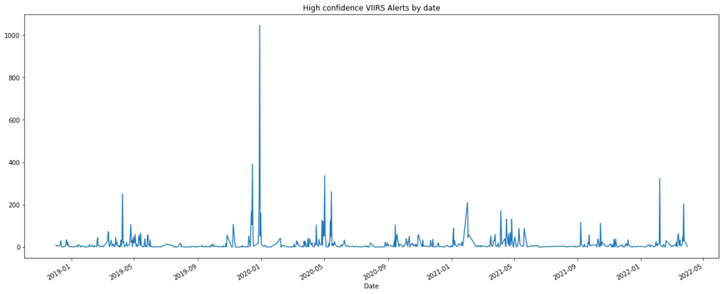
Clearly, this fire season is not as intense as that one from the Black Summer, which occurred two years ago, from August 2019 to April-May 2020. However, it looks still more intense than the one from one year ago. Following this, I decided to look at the aggregated number of points from the August-March seasons of the three different years to get a better feeling for the intensity of this year's fire season:
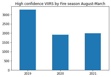
So, the fires within the study area for the dates between the 1st of August 2021 and the 31st of March 2022 seem to be a little more intense, in terms of the number of fire alerts, than the one from one year ago in the same area and dates. And a little more than half as intense as the one from 2019.
Following the fires
Below we can see a false-color image from a satellite meant to allow easier identification of fire scars. This image corresponds to a beach in Hamelin Bay, south of Margaret River, taken on March 2022. Here it is possible to see a big fire scar mapped by the trained classifier. According to this classification, the fire raged from the 8th of December until the 28th of December of 2021. This particular fire made it to the headlines of several newspapers due to its intensity, extension and closeness to important populated areas.

Now we can zoom a little bit and take a look at how that place was before and after the fire raged. Two natural-color satellite images are shown below. The one at the left of the slider corresponds to November 2021, the one on the right is from the end of December 2021. The estimated burned area is more than 5000 hectares.


This types of analysis are very easy to achieve using the EDEO BlazeMap™. You can see the corresponding BlazeMap™ for the study area around Perth for the fire season between 1st August 2021 and 31st March 2022 and explore the spatiotemporal extent of the fires with ease.
Record emissions from wildfires in Argentina
According to the Copernicus Atmosphere Monitoring Service, fire activity in the first months of 2022 in South America has been the most intense since the beginning of the study, in 2003. What is the meaning of this? Sadly, the meaning of this is that we can expect wildfires that will be both more intense and more frequent. So, one starting point to understand the consequences of wildfires and make better decisions to reduce their negative impact is to have a better way to efficiently map and monitor them.
In the beginning of 2022, a massive number of fire outbreaks** took place in the North-eastern region of Argentina. This region includes the province of Corrientes and the Iberá National Park, one of the most important wildlife sanctuaries in America.
The catastrophe in Corrientes was not only aggravated by last year's strong heatwaves and their corresponding droughts, but also due to people actively engaging in starting fires in the region**. This set of conditions makes it very difficult for local authorities to respond efficiently to stop the wildfires from spreading and growing.
This document uses the automated pipeline designed at EDEO to provide an estimation of the amount of hectares lost to wildfires in a study region around Corrientes. The study comprises the period of December 2021 to the 14th of February 2022. In the future, we could get a better idea of the intensity of the catastrophe comparing the obtained values to the amount of hectares lost to wildfires one or two years before on the same region.
**source in spanish
A bird's eye view of the problem with the EDEO Pipeline
The EDEO pipeline allows to efficiently gather data to build a fire monitoring system on demand on a wide range of scales. First, I specified the study region and dates of focus for the analysis. Then, I ran the pipeline to get all the information needed to develop a machine learning model to classify burned areas.
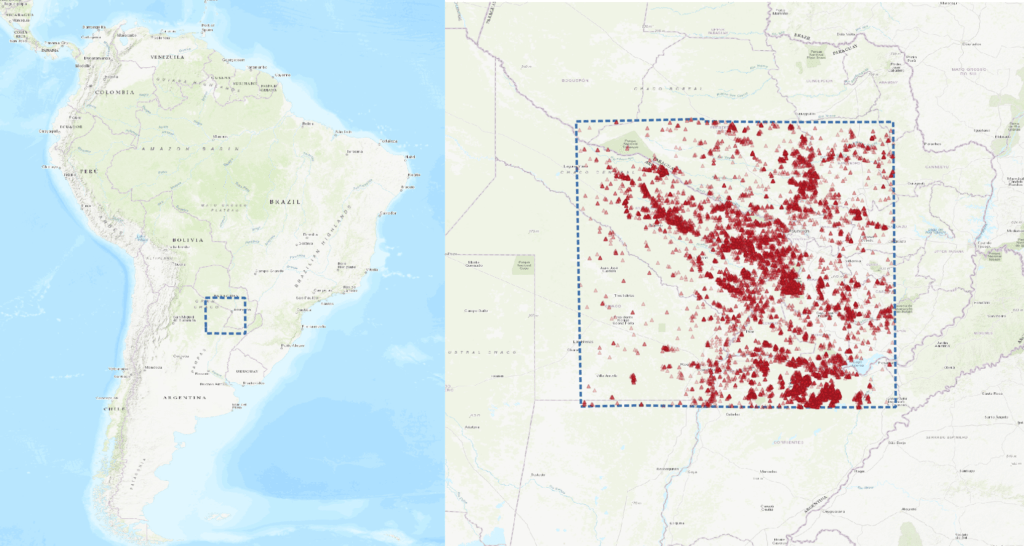
The area I decided to study includes several populations that were affected by the ongoing fires. It comprises the border between Argentina and Paraguay and it made it to the main pages of several local newspapers due to the catastrophic fires that raged within this months. Recently, the fires were reported to finally be under control on the first of March** of this year.
Some of the images I encountered during my analysis really perturbed me after seeing the intensity and extent of the fires. This was even worse when I stumbled upon pictures where the fires could be seen raging, like the image below, from the 31st of January of 2022.


**source in Spanish
A map is worth a thousand images: the EDEO BlazeMap™
The last step of the EDEO pipeline is to generate all the inputs needed to create what we called the BlazeMap™. It was introduced in this news post. This map shows the start and ending dates, as well as the number of hectares lost to a given wildfire. You can explore for yourself the alarming estimate of 1.5 million hectares lost to wildfires from 1st of December 2021 to 14th February 2022. This amounts to almost 6% of the study area.
Nine First Nations Evacuated due to Wildfires near Lake Winnipeg in 2021
What happened?
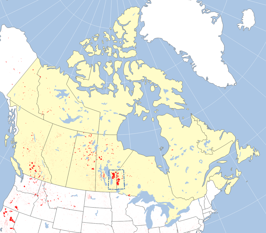
Over the summer of 2021, over one million hectares of forest burned down east of Lake Winnipeg (Ojibwe: ᐑᓂᐸᑲᒥᐠᓴᑯ˙ᑯᐣ) in Canada. The affected area straddling the Manitoba-Ontario border is mostly inhabited by First Nations. Over 8 000 residents from nine First Nations had to evacuate to be safe from the fires. Most residents had to stay away from home (typically in the city of Winnipeg) for about three weeks. However, the First Nations of Little Grand Rapids and Pauingassi were unable to return to their homes for over eleven weeks. This was because wildfires destroyed the power lines supplying their homes and it took that long to repair them. Evacuees had reported that they had a very hard time coping with city life and Covid-19 restrictions (GlobalNews).
We created a wildfire map of the affected area. You can find the interactive map at the bottom of this news release.
Our BlazeMap™
At the end of this article you'll find an interactive version of our BlazeMap™ created with the latest machine learning technology. To create the burned area polygons, we ran the machine learning system we had used for our study area in Siberia on more than 1 000 satellite images.
Check out the interactive map at the bottom! You can click on each burned area cluster and it will show you the start and end dates of the fire as well as the total area. Furthermore, the individual First Nations inside our study area are shown with black and red markers. Red markers indicate First Nations that evacuated partly or fully. If you click on one, you'll see the approximate evacuation dates, number of people evacuated, and a link to a pertinent news story.
The total size of the study area is 13 452 000 hectares. Of these, the wildfires burned 1 012 000 hectares according to our machine learning system. That's 7.5% of the total.
Do you need the map on the bottom for your own geospatial analysis? We can send you the file free of charge. Just send us an e-mail and tell us a little bit about your use case. We'll send you the map in your preferred format.
How good is this map?
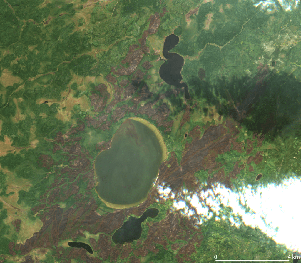
As always, our map is accurate to 40 meters. The images below show how closely our BlazeMap™ tracks the actual burned area. Our wildfire map even reflects tiny patches of burned area and small unburned islands. You can also see that our machine learning system has no problem with clouds or cloud shadows. This is because it considers satellite images from multiple times.
The overall accuracy of the map is 98%. We achieved a precision of approximately 85% and a recall (detection rate) around 95%. That means out of 20 validation plots inside our burned area result, the wildfire had scorched 17 in reality. Conversely, of 20 plots burned on the ground, 19 would be detected. We can significantly improve these scores if we tailor our system to a study area's local conditions.
Our BlazeMap™ machine learning system is the most accurate burned area mapping system on the market. The 40-meter spatial resolution of our wildfire map beats all other burned area map providers by an order of magnitude. In addition, we are happy to guarantee accuracies exceeding 90% (for both precision and recall) to our paying customers. In ideal circumstances, we can deliver the BlazeMap™ as soon as 48 hours after you place an order. This is possible due to our machine learning system's high level of automation.
How can wildfire maps help you?
Our 40-meter BlazeMap™ is the perfect data source for any use case that requires a detailed and accurate burned area map.
Let's entertain a counterfactual: Imagine you're working for Manitoba Hydro in the summer of 2021. Your power lines stopped delivering electricity, like they did. Imagine you had access to our wildfire map. You could have quickly identified potential damage to the power lines and how access to them might be compromised. This way you could have sped up the repair campaign. Then, the Little Grand Rapids and Pauingassi First Nations could have returned to their homes sooner.
Another use case: BlazeMap™ can be integrated into public wildfire information systems like Canada's CWIFS, NASA's FIRMS or Europe's EFFIS. Or would you like to estimate CO2 emissions from our area-true wildfire maps? We can make that happen. Do you need accurate burned area maps for your wildfire research? We've got you covered. These are just a few of the use cases we can think of.
Note that due to the high level of automation, we can provide our mapping services relatively cheap. For instance, for the analysis presented here we would have charged EUR 6 400 (CAD 8 800, USD 7 100). However, you can rest assured that our wildfire experts vet the result.
Could you benefit from better wildfire maps? Then feel free to shoot us an e-mail with your use case. We'll get back to you with our offer. Do you need more information in addition to your BlazeMap™ wildfire map? We're happy to provide any additional geospatial or forestry analysis that you need for your project.
Interactive wildfire map
Here's the interactive map!
Updated burned area maps in Siberia
We made some updates to our map of wildfire burned areas in Sakha Republic (Siberia) that we published in November. We mapped an area of 92.62 million hectares at 40 meter resolution. For our study area we chose a region around the city of Yakutsk where many wildfires burned in the 2021 season. In fact, we found that an area of over 7.3 million hectares was burned. That's 7.9% of the total. Combining the power of machine learning with our team's expert knowledge in forestry, we've come up with a new and improved map.
The new dataset features a number of small tweaks, most aimed at improving detection of areas burned in September. These are sometimes tricky to distinguish due to fallen leaves and low sun angles in autumn.
What insights does our map provide?
Our map reports burned area extent at unprecedented detail, at a scale of 40 meters. In addition, for each fire cluster we report its area in hectares as well as the first and last dates a burning fire was detected somewhere in the cluster. To see this information, just click on any fire cluster on the map.
You can request the data shown in this map from us and integrate it into your own GIS analysis. One interesting use case we can think of is to estimate the amount of CO2 released by the wildfires. That is an analysis we are also happy to provide to interested customers.
How good is this map?
We achieved a precision of 98% and a recall of 88%. That means if you pick any point inside our fire polygons, the probability that it was actually burned is 98%. Conversely, of the points labeled as burned in the validation data, 88% were inside our burned polygons. To come up with these accuracy figures, we hand-labeled 4000 validation points based on the Sentinel-2 images we used for the classification. Our automatic processing pipeline then checked if these labels matched the burned area polygons. The combination of high precision and comparatively low recall means that our burned area estimates are conservative – the total burned area is likely higher than reported above.
The map is provided at a spatial resolution of 40 meters. That is, the boundary of each map polygon is no more than 40 meters away from the burned area perimeter on the ground.
What about burned area maps for other regions?
Early next year we plan to release a map of areas burned in Central Canada in 2021 as well as a map of the bushfires currently raging in Western Australia. This will give us an opportunity to find out how applicable our approach is to different landscapes and what tweaks might be needed.
Are you interested in wildfires in a particular area of the world? Then send us an e-mail with your request. We can provide burned area mapping of an area up to 10 million hectares free of charge so you can judge the quality of our work. If you're happy with the results, we would be excited to set up a nation-wide burned area mapping service for you at a competitive price.
Note that the map below may take up to a minute to load.
Mapping the new wildfire paradigm in Siberia
Due to climate change, natural disasters have proliferated in the last months. We saw deadly floods this summer in Germany and Belgium. And British Columbia (Canada) is currently battered by storms that have cut off some three million inhabitants of the Lower Mainland from the rest of the country. The Northern hemisphere summer brought the largest wildfire season in recorded history. Especially fires in California (USA) and Sakha Republic (Russia) made the news. According to NASA, the wildfire paradigm in Russia has changed over the last decades – wildfires got fewer in number but larger. We had a closer look at an area of close to 100 million hectares in Sakha Republic that suffered from the worst fires. We considered the area from 111 to 137 degrees East and 60 to 67 degrees North. For this study area we created a detailed map of all areas burned up to September 2021.
How we made this map
To create this map, we relied on machine learning and large scale satellite data processing techniques to map the burned areas in our study area. We used 4501 multispectral images from ESA's Sentinel-2 satellites.
After many iterations, we managed to process the data for the whole study area over the course of three days on a normal desktop workstation. This leaves room to upscale our technology to larger areas. It turns out that more than 6.7 million hectares or about 7% of our study area were burned. For comparison, Zhenya Naumova of Greenpeace Russia gave an estimate of the burned area over all of Russia at 17.5 million hectares when the fire season was still ongoing in mid-September.
Talk to us!
At EDEO, it is our passion to derive useful insights from geospatial data for our clients and the public. To make better decisions, you need to understand the available data. We help you with that. If you have any questions, don't hesitate to get in touch. We are happy to provide the data shown on the map for free if you let us know your use case. Or do you need geospatial analysis of your topic of interest? Let's talk. You have comments on our work? Then leave them in the comments section. To stay up-to-date with our mapping projects, follow us on Twitter. We are planning to share an improved version of this map in December.
Note that the map may take up to a minute to load.